-
The Skills proficiency insights dashboard
Read articleThis article outlines the Skills proficiency insights dashboard and how admins can access the feature.
The Skills proficiency insights dashboard provides insights on learners’ skill proficiency levels as demonstrated via their assessment results.
Note:
- Advanced skill proficiency insights are available on the Enterprise plan.
- The Skills proficiency insights dashboard displays assessment-based proficiency data. If an organization doesn’t have any assessment results yet, it will show a message indicating that no skill proficiency data is available. Learn more about assessments.
For additional insights, admins can access the Skill Insights dashboard to understand your employee’s learning priorities, by drilling into categories and topic data to see where their learning time is being spent.
Table of contents
- How to access the Skills Proficiency Insights dashboard
- Overview of the Skills Proficiency Insights dashboard
How to access the Skills Proficiency Insights dashboard
Admins can access the Skills proficiency insights dashboard by navigating to the Manage tab at the top right of the page, then selecting Insights and reporting > Skills proficiency insights in the left hand navigation.
Dashboard filters
You can use the dashboard filters to view data by time period, user type, and skills.
With the Skills filter, you can search for and select up to ten specific skills to further assess your organization’s needs by a particular skillset.
Overview of the Skills Proficiency Insights dashboard
The Skill proficiency insights dashboard gives you a clear, data-driven view of how your employees’ skills are developing over time. It translates their assessment results into actionable insights, helping you understand strengths, gaps, and progress at both the team and organizational level.
By focusing on skill growth rather than just activity, your organization can shift the conversation from “How much learning happened?” to “How much skill was gained?"
The Skills proficiency insights dashboard includes:
- Learners assessed: The number of learners that have completed an assessment in the selected period.
- Assessment attempts: The total number of assessments completed during the selected period. This includes both first attempts and reassessments.
- Reassessment attempts: The number of assessments taken during the selected period that were re-assessments.
- Reassessment improvement %: The percentage of assessed learners who improved in the selected period, for example, moving from Developing to Established. A low percentage may indicate more learning is required between attempts.
- Skill improvements (Enterprise plan only): The total sum of improved skills across all learners. For example, if Learner A improved in Skill 1 and Skill 2, and Learner B improved in Skill 1, the Skill improvements metric will display 3.
- Improved learners (Enterprise plan only): The number of learners who improved at least one skill by one skill level.
Skill assessments over time
The Skill assessments over time graph
Skill-level distribution change (Enterprise plan only)
This Skill level distribution change graph shows the change in overall skill level distribution. The second column shows the latest distribution at the end of the selected period and the first column shows the starting levels of those attempts.
In this example, we see a 2% increase in learners who have achieved the Superior proficiency level and a 3% reduction in the amount of learners who have achieved the Limited level.
Skills proficiency list
The Skills proficiency list table gives you a skill-by-skill breakdown, showing which skills were most assessed, how many learners completed an assessment, how often they reassessed, how many improved, and the distribution of proficiency levels for each skill for the time frame.
The table shows a per skill breakdown, ordered by the most popular skills in the period (based on the number of assessments taken).
- Subject: The title of the assessed skill.
- Learners assessed: The number of learners who took the assessment in the period.
- Assessment attempts: The number of assessments taken in the period.
- Reassessments attempts: The number of assessments taken in the period that were re-assessments.
- Skill Improvements: The number of skill level improvements that took place in the period.
- Skill level distribution: The distribution of skills levels for the skill by the end of the selected period.
Priority skills
Click the Priority skills tab to see a table highlighting the chosen skills.
You can select priority skills to focus on the areas that matter most to your organization. If none are selected, the first time you open the tab you'll be prompted with a modal to choose your priority skills.
To change the list of priority skills, select Edit priority skills at the top of the table. You’ll then be able to select, search, or manually type in a list of skills that are of the highest priority to you.
Skills data view by plan type
All UB Enterprise, Pro, and Team Plan customers can see the Skills Proficiency Dashboard under Insights & Reporting in the Manage tab.
Once you access the dashboard, your visibility will depend on your plan and whether assessment data exists for your organization. Some advanced skill proficiency insights are available on Enterprise plan only.
Udemy Business Enterprise and Pro customers with assessment data
- You will see a fully populated dashboard.
Udemy Business Enterprise and Pro customers without assessment data
- Both customer types will see a no data available message (see the screenshot below). The Assign assessments button takes admins to the assessments listing page, and the Learn more button links to the assessments help center article.
Former Pro customers who downgraded to the Enterprise plan
- If your organization once had the Pro Add-on and generated assessment data while on Pro, that historical data will still appear in your dashboard.
Udemy Business and Pro Trial customers who did not convert
- If assessment data was created during a Trial, it will continue to appear in the dashboard even after the trial ends.
New Ventures customers
- New Ventures customers will not see the Skills Proficiency Dashboard in the sidebar.
-
How to Set a Learning Target for Your Organization
Read articleThis article provides an overview of the Learning target feature and how to set a Learning target for your organization in your Udemy Business account.
Table of contents
- What is a Learning target?
- Who can set a Learning target?
- How to set a Learning target
- How to monitor learning progress
- How to edit a goal or create a new goal
What is a Learning target?
With a Learning target, admins can easily set and share a target learning goal with their organization. This helps motivate learners by setting a target number of hours for them to learn in a specified timeframe.
Who can set a Learning target?
Admins and owners can set a Learning target for their organization.
How to set a Learning target
1. To access the Learning targets section, click on User Activity under Insights and reporting in the Admin tools section.
2. Select the Learning targets tab.
3. Click Set learning target to begin setting a goal.
4. Follow the steps to set a title for the learning target, add a target time, and duration (date range).
5. Using the editable sample template, you can send an email to all learners about the goal and encourage them to start learning. Once you select Publish goal, the goal will be set, and the email will be sent to all learners.
6. After publishing, the Learning targets tab will display the goal with a Scheduled status until its start date.
7. Once the goal begins, the status will change to In Progress. When the goal expires, it will update to Completed.
How to monitor learning progress
After setting the Learning target, you can monitor learner progress in two ways:
Admin page: Access an overview of your learning target under Learning Target Progress.
User activity: Click the Learning targets section to access a dashboard for tracking progress throughout the target's duration.
- Note: Dashboard and data are updated up to four times per day. The date and time up to which data is included is indicated by a data freshness notice in the top right of each dashboard. The timestamp is localized based on your computer’s local settings.
Use the Send a Reminder option to email different learner groups based on their progress status.
How to edit a goal or create a new goal
This feature allows you to set one organizational goal at a time and doesn't currently support multiple goals for different user groups.
To edit an existing goal, delete the current one and follow the steps above to create a new goal. You can also create a new goal once the current one has expired.
-
User Activity Dashboard: Team Plan
Read articleThis article outlines the features and functionality of the Team Plan User activity dashboard, which provides admins with a macro view of how active learners are in their Udemy Business accounts.
Please note: an expanded version of this feature with data export reports is available with the Enterprise Plan.
- Enterprise Plan account: learn how to access your user activity.
What information and metrics are on the Team Plan User activity dashboard?
To view the User Activity dashboard, please navigate to your Admin Overview page. From there, select User Activity from the left-hand side panel.
Note: To navigate back to the learner homepage with courses and content, click on the logo on the top left hand corner of your logged in account.
Some of the user activity metrics that are featured on this dashboard include total activity, average activity per user, average activity per active user, and active user base. In addition, the activity trend chart and the most active users are listed here.
- Review what defines an active user so their learning is captured in Insights and reporting.
- Learn more about the difference between activated and deactivated users and how it impacts admin reporting.
How are the minutes spent calculated compared to the Activity trend?
The Activity trend line is an approximation of the Minutes spent line where the spikes are smoothed out so that the general trend can be more easily visualized. This is done using a regression algorithm which calculates a moving average of the minutes spent to plot the Activity trend line.
When is data in the User activity dashboard updated?
Data in the User activity dashboard is updated regularly.
-
Badge Insights
Read articleUdemy Business includes our Badge Insights dashboard, which provides admins or group admins with an aggregated view of what badges your learners are working towards, or have imported into your Udemy Business account.
This enables you to easily identify, at a glance, the number of users within your organization who have validated their skills by earning a third party certification, as well as track how many learners are progressing towards their certifications within Udemy Business.
How to access the Badge Insights dashboard
Admins or group admins can access the Badge Insights dashboard by moving their cursor to Manage at the top of the page, and then by selecting Insights and reporting and then Badge Insights.
The data obtained from the imported badges are also available via APIs. For more information on integrating with the Badging APIs, input https://<company name>.udemy.com/dev-portal/api-reference/, with your organization’s domain reference.
Reviewing a specific learners’ certification badge achievements
Learn how admins and group admins can view their learners’ certification badge achievements.
-
Skills Benchmarks: Frequently Asked Questions
Read articleThis article answers frequently asked questions about the Skills Benchmarks feature, available in the Skill Insights dashboard.
Frequently asked questions
- What are Skills Benchmarks?
- Where can I access the feature?
- What are the most common use cases for the data?
- Why does this data matter?
- Who is this report for?
- Why do benchmarks not appear in my dashboard?
What are Skills Benchmarks?
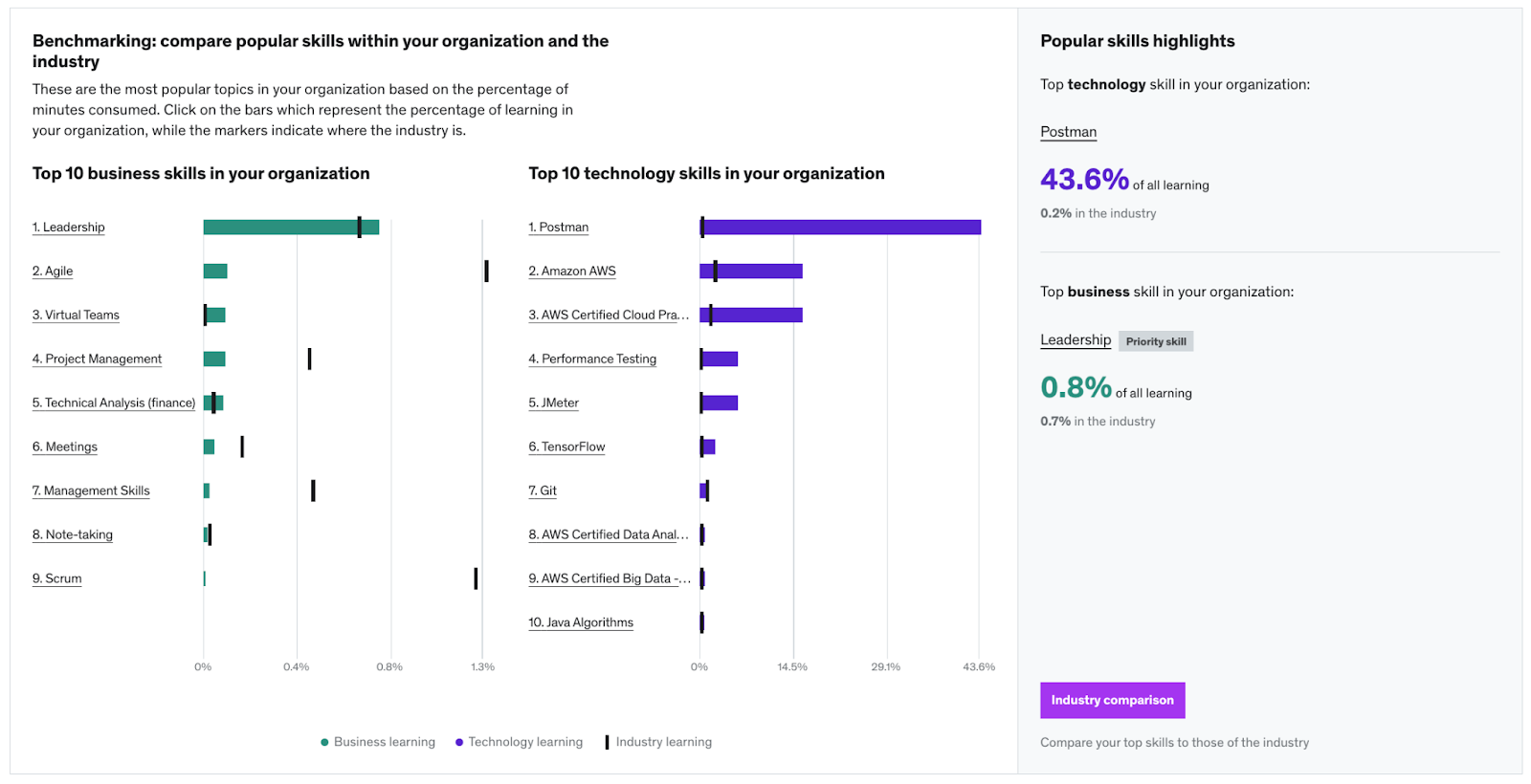
Skills Benchmarks is a Skill Insights dashboard feature that allows admins and group admins to view popular skills within their organization and compare those skills to industry benchmarks.
By surfacing benchmarks on industry trends, customers can see how they’re tracking against other companies across a range of skills.
Where can I access the feature?
Skills benchmarks can be accessed alongside other insights in the Skill Insights dashboard (Learn more).
What are the most common use cases for the data?
Some of the primary uses for this data include:
- Redirect your employees toward more relevant learning
- Understand the skill levels within your organization and how that compares to your industry
- See what skills gaps you should address in your learning strategy
Why does this data matter?
With Skills Benchmarks, you can compare your Udemy Business learning trends, not only within your own organization, but also across other companies in your industry.
Who is this report for?
The dashboard is for all admins and group admins.
Why do benchmarks not appear in my dashboard?
We aim to provide the most accurate and meaningful comparisons when it comes to providing benchmarks. To make sure we are delivering the most valuable insights, and to maintain data privacy and integrity, Udemy provides anonymized, amalgamated benchmarks if more than 5 companies fulfill the comparison group criteria of :
- Industry
- Company size
- Region/country
-
The Skill Insights dashboard
Read articleThis article outlines important information regarding our Skill insights dashboard, which visualizes the skills of your company based on the content that you are consuming/ learning.
Note: Custom courses created in the course creation tools will not show up in the Skill Insights dashboard. Learner activity and progress for custom courses can be viewed in admin data reports.
Table of Contents
- How to access the Skills Insights dashboard
- Overview of the Skill insights dashboard
- Frequently asked questions about the Skill insights dashboard
How to access the Skills Insights dashboard
Admins can access the Skill insights dashboard by moving their cursor to Manage at the top of the page, and then selecting Insights and reporting and then Skills insights.
Overview of the Skill Insights dashboard
The Skill insights dashboard enables you to understand your employees’ learning priorities, by drilling into categories and topic data to see where exactly their time is being spent. This knowledge can help you drive learning in a direction that helps you reach your organization’s goals and to see if your employees' learning aligns with your business goals.
The Skills insights dashboard includes:
- The percentage of time spent learning business, tech, and personal development skills.
- A total count of topics in business, technology, and personal development that your organization's learning spans.
- Data by all users or to dive into specific groups or sections.
- Learning data for specific time frames.
- An export option for the User skills activity report, which provides detailed skills activity per user in a CSV format.
- Note: The export option is available for Enterprise plan only.
- Learn more about the report fields included in the User skills activity report.
- An interactive chart that provides insights into the percentage of time spent learning and the total time spent learning by category, subcategory and topic. The side panel also shows the top courses for each category, subcategory and topic so that you can easily assign or recommend these to other learners in your organization.
Priority Skills
Each admin can set their Priority Skills, which facilitates tracking and reporting on the sub-set of skills that are most important to you. You’ll have the opportunity to understand skill gaps and to take targeted actions when needed.
Skills Benchmarks
Admins and group admins can view popular skills within their organization and compare those skills to industry benchmarks. By surfacing benchmarks on industry trends, our customers can see how they’re tracking against other customers across a range of skills.
- See answers to frequently asked questions about Skills benchmarks.
This chart shows the most popular business, technology and personal development topics in your organization ranked by time spent watching. The chart also details what percentage of total learning these top topics account for.
Frequently asked questions about the Skills Insights dashboardWho is the Skill Insights dashboard for?
The Skill insights dashboard is for all admins and group admins. Group admins will only be able to see skill insights for their groups.
How is time spent learning attributed to topic/category/sub-category?
The pie chart has four levels:
-
Business vs Technology vs Personal Development:
- Business includes all categories containing courses that are primarily focused on business.
- Technology includes all categories containing courses primarily focused on technology topics.
- Personal development includes all categories containing courses that are primarily focused on personal development topics.
- Subcategories: These are the subcategories shown in the Explore/Browse experience.
- Topics: Courses are tagged with topics. Some courses have one primary topic and all learning in the course is attributed to this primary topic. Other courses have more than one primary topic. In these cases, we attribute all learning in the course to each of the topics.
A course can exist within more than one subcategory and courses with the same primary topic can also exist in different subcategories. As a result, this means that learning attributed to a single topic can be split across multiple subcategories.
The top topics list includes all learning attributed to the topic regardless of which subcategory it belongs to.
Which learning categories make up each classification?
The categories include multiple topics, some of which are:
Technology:
- Cloud Computing
- Cybersecurity
- Design
- Development
- IT Operations
- Data Science
Business:
- Finance & Accounting
- Workplace & Human Resources
- Leadership & Management
- Marketing
- Project & Product Management
- Sales
Personal Development:
- Personal Development
-
Course insights
Read articleThe Enterprise Plan includes our Course Insights Dashboard, which provides you with a comprehensive view of the courses your users are learning. It also enables you to discover the most popular courses in your organization, based on Active Users, Average Minutes Watched (per active user), enrolled users, assigned users and ratings provided by learners within your organization.
Sorting and filtering course insights
You can sort by the number of Active Users, the Average Minutes Watched (per active user), the number of enrolled users or the number of assigned users, depending on which metric is most important to you.
You can use the filters to discover popular courses within the following:
- groups
- sections
- time ranges
- categories
For example, you can use the time range filter to see how many courses were active and how many users were active in each course within the Data Science category during the last 30 days. You can choose time ranges with day granularity within the last 120 days. Prior to this, monthly time ranges can be selected.
Definition of active
A course is active if there is at least one active user in it. Learn more about what actions are considered activity for users in Udemy Business.
While the time-range filter on this dashboard enables you to see course activity within the selected time range, the average ratings shown on it are the ratings given by your users over all-time (since June 30th 2020), regardless of what time range is selected. This enables you to see the overall rating for courses that are currently trending at your organization.
Viewing learner ratings and reviews
From the Course Insights dashboard you can navigate into each course to discover which users are enrolled and to see any ratings and reviews that learners at your organization have left on the course.
Viewing learner activity
From the Course Insights dashboard, you can click into any course to view learner activity. Important: When a learner enrolls in a course or is assigned a course, they will appear on this page in realtime. Their activity data, however, won’t be shown until the next data refresh. To learn about how frequently data is refreshed, click here.
-
The Ratings and reviews admin dashboard
Read articleWe want to empower our Udemy Business admins with actionable insights to help guide and optimize their learning programs. As an admin, through our ratings and review dashboard, you will not only be able to see how your employees have rated courses they’ve taken in Udemy Business, but also any reviews employees left on the course as well. We encourage you to utilize learner sentiment about courses to continuously make improvements to your course recommendations, the content within learning paths, and course selections for specific programs, etc.
How to access the Ratings and reviews dashboard
1. Click on the Manage menu in the top right of the screen.
2. On the right side, go to Insights and Reporting. Then, select Ratings and reviews.
Top 5 rated courses
This section will show the top 5 rated courses at your organization as well as the average internal rating for those courses. This will help you to understand well-received courses at a glance and the general sentiment about the courses from your learners.
Courses must have at least 3 ratings and have been active within the last 30 days to be included. (If there are none eligible in the last 30 days then the top 5 over the last 90 days is shown.)Recent ratings and reviews
This section contains all the ratings and reviews from learners at your organization (from June 30, 2020). You can filter them by:
- Date range
- User name
- Groups
- Rating
- Courses*
Ratings are sorted by most recent first. This will help you to understand the overall sentiment learners have about courses. You can also export a ratings report by using the Export tool.
*You can filter courses by courses available on the Udemy Business course collection or by custom courses created by your organization.
Course Insights dashboard
Rating information is also included on the Course insights dashboard, where the average internal rating for each course is shown (when there are at least 3 ratings for the course).
You can filter by the category enabling you to discover the highest-rated courses for a specific subject.
- Learn more about the Course insights dashboard..
Group admin access
Group admins currently do not have access to ratings and review dashboards.
How are internal course ratings calculated?
The average internal rating is calculated by the sum of all ratings from employees within the organization, divided by the total number of employees that rated the course.
We calculate and show the average internal rating for a course only when at least 3 ratings have been provided by learners at your organization.
Ratings and review data is only included from June 30th 2020.
Note: The internal rating is representative of only your organization and is calculated differently from the course rating that learners see, which includes ratings from all learners on Udemy.
Data freshness
The data freshness notice shows the latest time when all data has been last updated. The Top 5 rated courses section is up to date at this time, however, the Recent Ratings and Reviews section is updated in real-time.
-
User Adoption Funnel
Read articleOur User Adoption Funnel not only provides you with a view into how people are adopting learning, but also gives you the power to take direct action to get people to sign up, enroll in a course and start watching their first lecture.
How is adoption defined?
While adoption can mean different things for different organizations, at Udemy Business we define ‘adoption’ as the point at which users have watched their first lecture, after having joined and enrolled in a course.
The Organization Adoption Rate is the number of users that have watched their first lecture as a percentage of the total number of licenses you have purchased.
We present your user adoption in a funnel because it best describes the different steps users must take from when they first get access to Udemy Business until they reach the point where they’re learning, ie. watching their first lecture.
We highlight the steps of the funnel where there is a drop off in users joining, enrolling or watching a lecture to help you understand which users are not yet adopting Udemy Business and help you take action so you can encourage them to get started.
This report is in real-time and shows data since the creation of your organization's account.
Licenses
This is the total number of licenses you have purchased for your employees on Udemy Business.
Invitations Sent
This column shows you the number of invitations you have sent to your team. It includes users who have either accepted an invitation and joined your Udemy Business account or still have a pending invitation. Cancelled invitations are not included.
Details of invitations sent, and users who have not accepted their invitations is not shown for accounts that have SSO login enabled.
Joined
These users have accepted their invitation to join your Udemy Business account and have already logged in at least once.
Users that drop out of the adoption funnel at this step are the users that have not accepted their invitations yet. You can use the Email These Users link to remind them to claim their account, or the Manage Invitations link in the report for quick access to your pending invitations list.
Enrolled
These users have enrolled in at least one course. The course may have been assigned to them or it may have been something they found and selected themselves.
Users that drop out of the adoption funnel at this step are the users that have logged in at least once but have not yet enrolled in a course. You may wish to assign or recommend a course to help them get started. Or you can use the Email These Users link to remind them to start learning or export a list of these users and send it to the appropriate manager to follow up.
Watched
These users have watched their first lecture of one of the courses they have enrolled in.
Note: watched activity will be only reported when a user views and completes a video lecture. Completing other types of lectures, like quizzes, practice tests, coding exercises etc., will not prompt any activity.
If a user unenrolled from a course, then any watched activity that was recorded, will be removed from reporting.
Users that drop out of the adoption funnel at this step have enrolled in at least one course, but have not yet completed their first lecture. It might be worth sending them some encouragement. You can use the Email These Users link to remind them to start learning or Export a List of these users and send it to the appropriate manager to follow up.
Adoption by Groups or Sections
If you have groups or sections set up you can see how adoption is going for a specific group, set of multiple groups, or sections, by selecting it from the filter at the top of the page.
The Group Adoption Rate is the number of users (in a group) that have watched their first lecture as a percentage of the users who have joined your account.
If SSO is enabled in your organization, the adoption funnel will contain a scaled down version of the metrics provided in the Adoption Funnel.
Data on numbers of users joined, enrolled and watched will be displayed. Data on licenses and invitations is currently not displayed, as users are provisioned via SSO.
We encourage you to also view the User Activity and Course Insights Dashboards (not available for Team Plan customers) to get additional insight on your users’ learning and engagement activity.
-
User activity dashboard: Enterprise Plan
Read articleThis article outlines the features and functionality of the User activity dashboard, which provides admins a macro view of how active learners are in their Udemy Business accounts.
- Team Plan account: learn how to access your User activity dashboard
What information and metrics are on the User activity dashboard?
To view the User Activity dashboard, navigate to your Admin Overview page and select User Activity from the left-hand side panel.
All activity
On the All activity tab, you can view metrics such as total activity, average activity per user, average activity per active user, and active user base. In addition, the activity trend chart and the most active users are listed here. You can review activity metrics in visual format as well as export user activity and trends using reports.
- Review what defines an active user so their learning is captured in Insights and reporting.
- Learn more about the difference between activated and deactivated users and how it impacts admin reporting.
If you have groups or sections set up, you can view user activity for a specific group or section by selecting the group from the filter at the top of the page. You can also filter by active or deactivated users.
Learning targets
On the Learning Targets tab, you can set and share a target learning goal to help motivate your learners. You can also monitor progress and send reminders to learners.
What exports are available on the User activity dashboard?
There are three options for exports on the User activity dashboard:
User activity report (active users): Includes activity data for all activated users who have been active in their account in the selected time frame. In order to be considered active, a user must watch lectures, or attempt or complete a practice test. If a learner was active during the selected time frame and later deactivated, they will be included on the report.
User activity report (all users): Includes activity data on all activated users in an account, including deactivated users and users who weren’t active in the selected time frame.
User activity trend report: Includes data on minutes watched by each user for each day in the selected time frame.
- Learn more about the report fields included in User activity reports.
How are the minutes spent calculated compared to the Activity trend?
The Activity trend line is an approximation of the Minutes spent line where the spikes are smoothed out so that the general trend can be more easily visualized. This is done using a regression algorithm which calculates a moving average of the minutes spent to plot the Activity trend line.
When is data in the User activity dashboard updated?
Data in the User activity dashboard is updated regularly.
Insights
-
The Skills proficiency insights dashboard
Read article -
How to Set a Learning Target for Your Organization
Read article -
User Activity Dashboard: Team Plan
Read article -
Badge Insights
Read article -
Skills Benchmarks: Frequently Asked Questions
Read article -
The Skill Insights dashboard
Read article -
Course insights
Read article -
The Ratings and reviews admin dashboard
Read article -
User Adoption Funnel
Read article -
User activity dashboard: Enterprise Plan
Read article